Lecture 7: Data Visualization
DATA 101: Making Prediction with Data
University of British Columbia Okanagan
Background
- One of the most important aspects of data analysis is the generation of proper graphics.
- One of the main reasons data analysts turn to R is for its strong graphic capabilities.
- R’s model for constructing plots strikes a balance between structure and flexibility.
- The lecture will introduce some of the basic plotting features of R and explore some controls over their graphical components.
Basic Plots
Basic Plots
- The first few slides will discuss some popular ways of displaying information graphically.
- These include:
- Strip charts
- Scatter plots
- Histograms
- Boxplots
Strip charts
- Strip charts plot the given data in order along a horizontal line.
- To create a strip chart in R, we use
stripchart(). - We can think of strip charts as one-dimensional scatter plots (or dot plots).
- Naturally, strip charts are intended for one-dimensional data, that is, each observation is a single scalar value.
Strip chart
For example, let’s generate 100 observations from 1 to 10 and plot them in a strip chart.

Coincident points
Problem what happens if we have two points with the exact same value?
- These “coincidence points” can be dealt with in
stripchart()using themethodarugment. - The default method is to
"overplot"which simply plots points on-top of each other; see?stripchart - Other
methods include"jitter"and"stack"
Example with coicindent points
overplot

jitter

Strip charts
x
 1  2  3  4  5  6  7  8  9 10 11 12 13 14 15 16 17 18 19 20
2 3 1 3 2 3 2 4 1 5 3 2 5 1 2 3 1 5 1 1 
Scatterplots
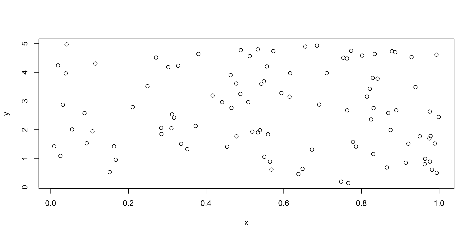
- If we extend the concept of the one dimensional strip charts to two dimensions, we get a scatter plot.
- Like strip charts, every observation will be represented by a single point on the chart, only now, that location will depend on two values.
- The first value gives its placement in the horizontal direction (ie. the \(x\)-axis), while the second number gives its placement in vertical direction (i.e. along the \(y\)-axis).
- Plots of this type are produced using
plot()in R.
Scatterplots
Histograms
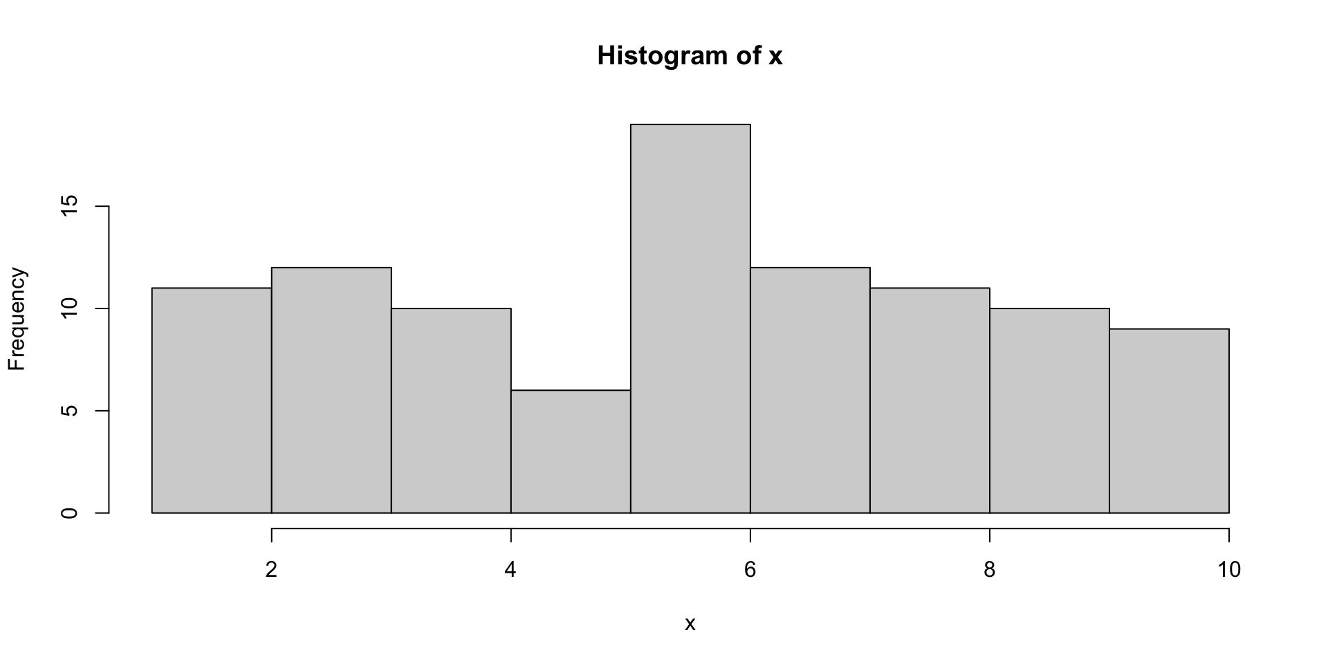
- A histogram is very common visualization that plots the number of observations appearing within certain ranges called bins.
- Bins (or buckets) are constructed by dividing the entire range of values into a series of intervals and counting how many values fall into each interval.
- In R histograms are produced using the
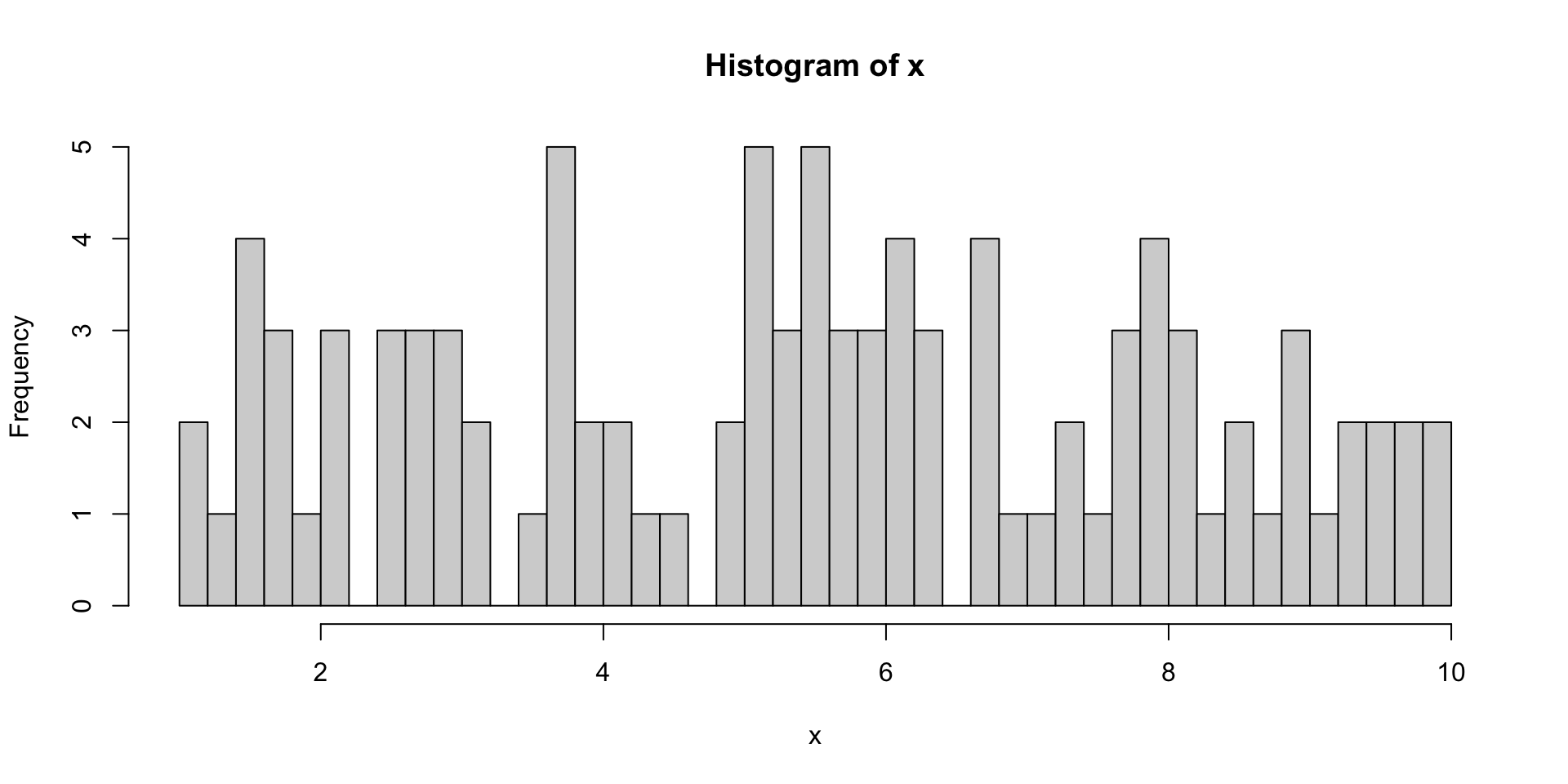
hist()function which tries to calculate reasonable bins automatically; however, we can manually set them ourselves in thebreaksargument
default hist
adjusting breaks
Density Plots
- One of the main uses of histograms is to provide a visualization of the distribution of our data.
- As exhibited in the previous example, this visualization technique can be greatly affected by the number of bins.
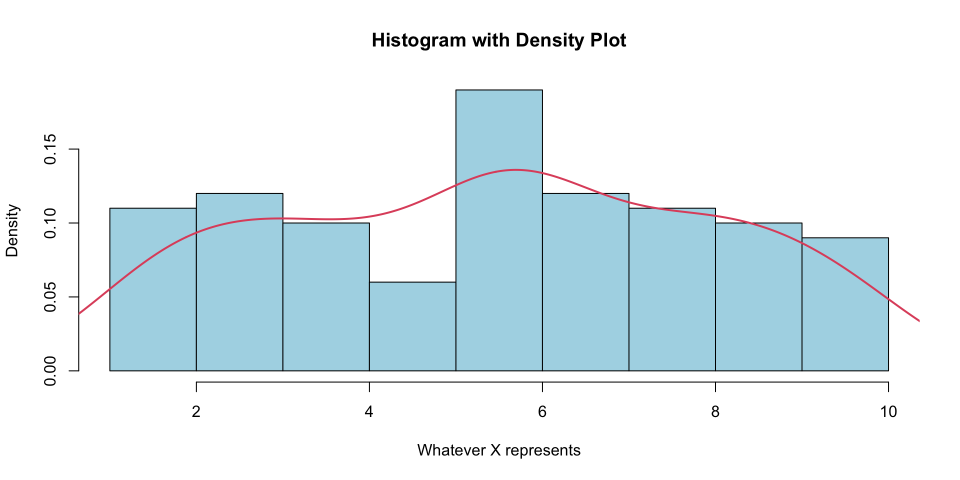
- We may prefer to create a smoother density plot to get a more accurate view the distribution of a variable.
- The general syntax for producing density plots is
plot(density(x)).
density plot

compare with hist
compare with hist
R Colours
- Notice that by setting
col=2 the boxplot turned red. - Integer
colvalues index the colours in R’spalette(). - R’s default colour palette looks like this:
[1] "black"   "#DF536B" "#61D04F" "#2297E6" "#28E2E5" "#CD0BBC" "#F5C710"
[8] "gray62" 
R Colours
- In words,
1 = "black",2 = "red", and so on. - Of course we can always call the full character name instead.
- See for example here for a gallery of colour names
- Alternatively we can redefine our colour palette so that
1="yellow", and2="green"for example:
Graphing Parameters
- While many of the plotting features like title and axes labels can be called directly within the plotting function, it is possible to call them afterwards.
- Just like
lines()superimposed a line overtop our histogram, we can superimpose text in the form of titles and labels (among other things) to a plot that has already been graphed. - For example, we could add titles and labels for out boxplot on car mileage using the
title()command.
same plot
- To see both the histogram and density curve on one plot, we use the
lines()function to superimpose the density curve on top of the histogram. - Here we use
probability = TRUE(same asprob = TRUE,freq = FALSE) - If
prob = TRUE/freq = FALSEthe proportion (rather frequencies) are plotted on the \(y\)-axis.
Boxplots
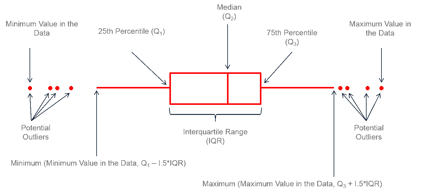
- A boxplot (AKA box-and-whisker plot) provides a graphical view of the median, quartiles, maximum, and minimum of a data set.
- When applicable, it can tell identify outliers and their values.
- The plots are great when comparing groups; however, they can be misleading when there are very few data points (in which case we should probably use a strip chart).
- These plots are available through the
boxplot()command.
Boxplot
Box
The central part of the boxplot is the “box” itself.
It represents the interquartile range (IQR), which spans the middle 50% of the data.
The bottom and top edges of the box correspond to the first quartile (Q1) and the third quartile (Q3), respectively.
The height1 of the box is determined by the range between Q1 and Q3. The box typically contains a horizontal line inside it, representing the median (Q2) of the dataset.
Quantiles vs Quartiles
Quantiles are a way to divide a dataset into equal portions1. For boxplots we need:
Median (Q2 or the 50th Percentile): the middle data point when dataset it is ordered from smallest to largest. It divides the data into two equal halves, with 50% of the data falling below it and 50% above it.
First Quartile (Q1 or the 25th Percentile): Q1 divides the lowest 25% of the data from the rest. It is the data point at the 25th percentile, meaning that 25% of the data falls below it.
Third Quartile (Q3 or the 75th Percentile): Q3 divides the lowest 75% of the data from the rest. It is the data point at the 75th percentile, meaning that 75% of the data falls below it.
IQR
- The Interquartile Range (IQR) is a statistical measure that represents the range between the first quartile (Q1) and the third quartile (Q3) in a dataset.
\[IQR = Q3 - Q1\]
- IQR It is a measure of statistical dispersion and provides valuable information about the spread of data within the middle 50% of the dataset.
Whiskers
- The “whiskers” extend from the box to the minimum and maximum values within a specified range.
- Commonly, the whiskers extend to the lowest data point within 1.5 times the IQR below Q1 and the highest data point within 1.5 times the IQR above Q3.
- Data points beyond these limits are often considered potential outliers and are plotted individually as dots or asterisks.
Outliers
- Outliers are individual data points that fall outside the whisker limits.
- These points are often plotted separately to draw attention to their exceptional values.
- They can be legitimate data points that indicate extreme values or errors in the data collection process.
Example: mtcars
For demonstration purposes, let’s have a look at the
mtcarsdataset; see?mtcars.-
We’ll focus on
-
mpgMiles/(US) gallon -
cylNumber of cylinders
-
Comment
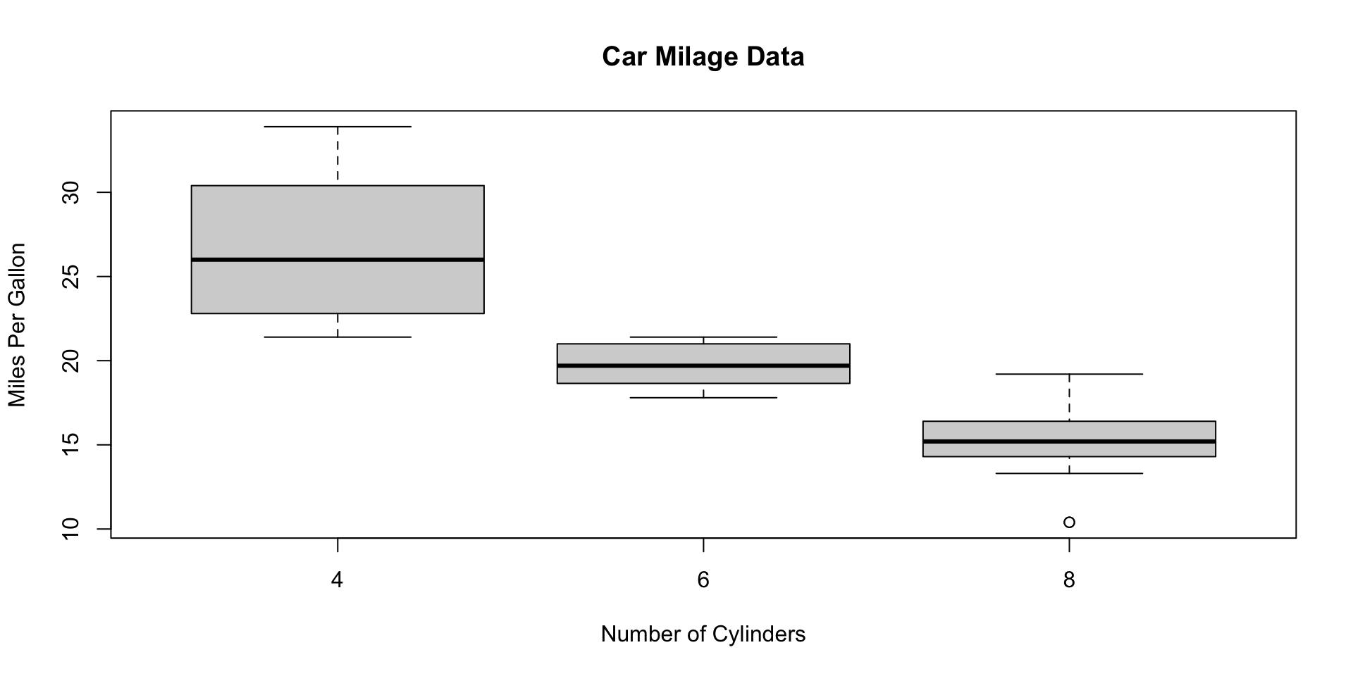
- The boxplot on this slide is a so-called side-by-side boxplot.
- We can think of it 3 boxplots in one plot.
- Starting from the left, we see a boxplot for the
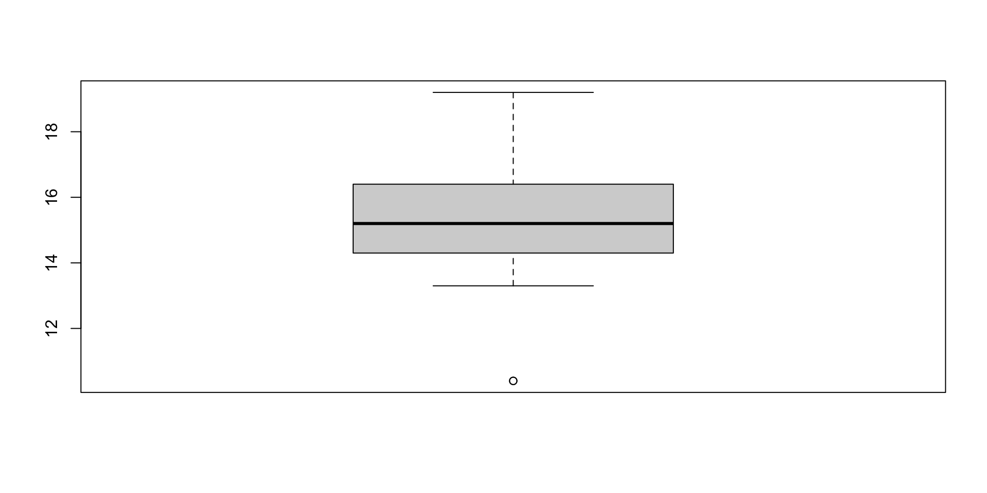
mpgvariable for cars with 4, 6, and 8 cylinders, respectively. - If we want to investigate the individual statistics for cars with 8 cylinders, say, we could also use
subset()orsplit()
Boxplot with subset
Legends
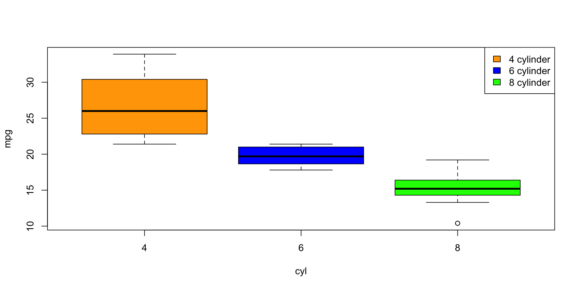
- Another useful plotting features is legends. General syntax:
-
locationcan be specific co-ordinates or a keyword: “bottom”, “bottomleft”, “left”, “topleft”, “top”, “topright”, “right”, “bottomright”, or “center” -
legendis a vector of characters to appear in the legend. -
...provide the characteristics, eg.col(colour),lty(line type),pch(plotting character) distinguishing the members in your legend.
Plot size
- In RStudio, we can resize the image by pressing the
![]() button1 and use click and drag on the plotting window.
button1 and use click and drag on the plotting window. - In Rmd, the default
widthandheightfor R plots are set to 7; we can change these defaults using thefig.widthandfig.heightcode chunk options2
Graphing Parameters
- There are a number of graphical parameters that are available through the
par()function. - It is important to mention, that
par()sets the global state for any graphical related commands. - To put another way, all future plots in your plotting device will inherit this change (that is, until you open a new session, close the plotting device via
dev.off()or change them back to their default). - To see the complete set of graphical parameters, type
?par
Graphing Parameters
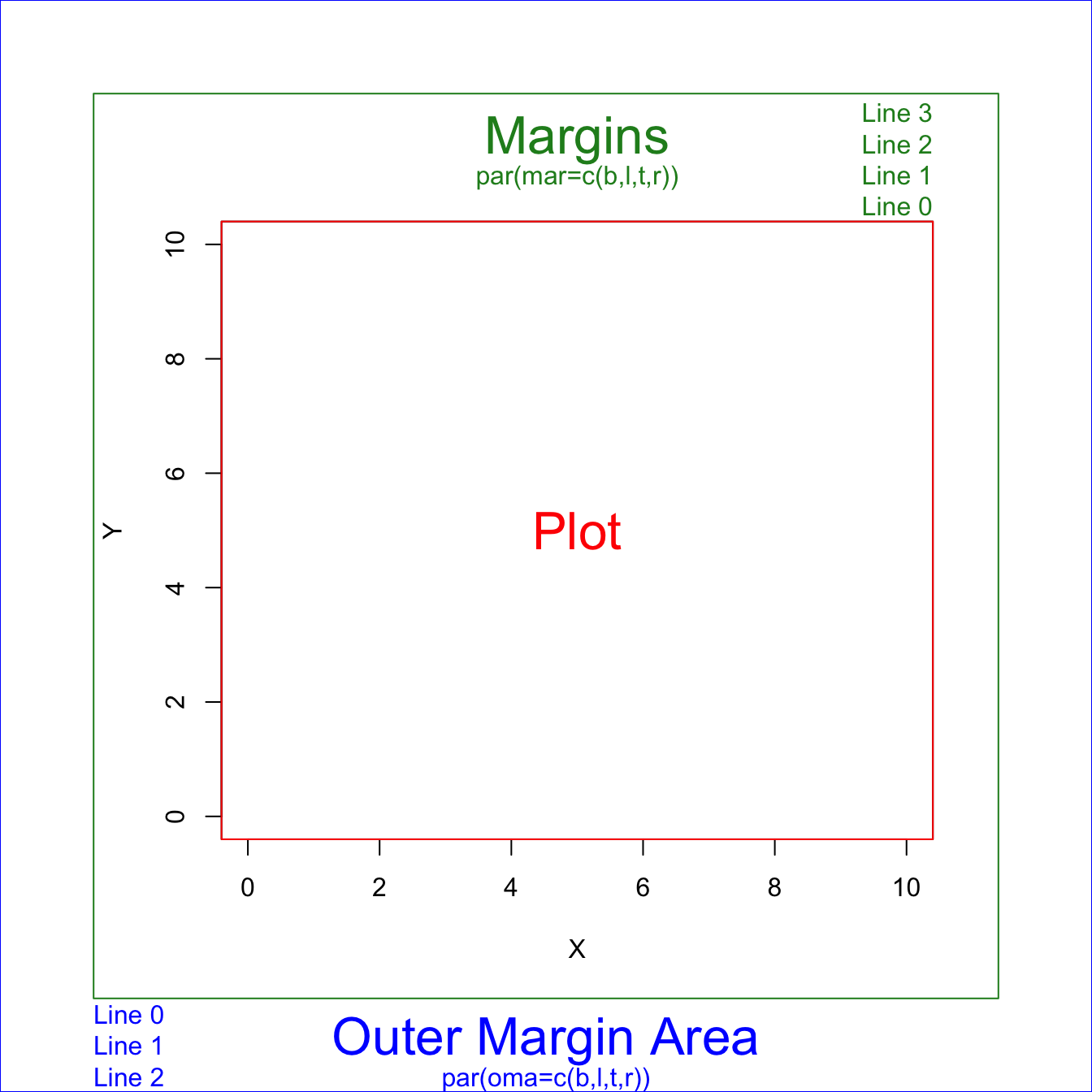
There are 2 margin areas in R:
-
mar()for margin -
oma()for outer margin
You can specify the desired space in the bottom, left, top and right using the syntax:
par defaults
To see the default setting (assuming you have redefined them already):
It is useful to sometimes change the defaults to remove excessive white space
Exercise 1
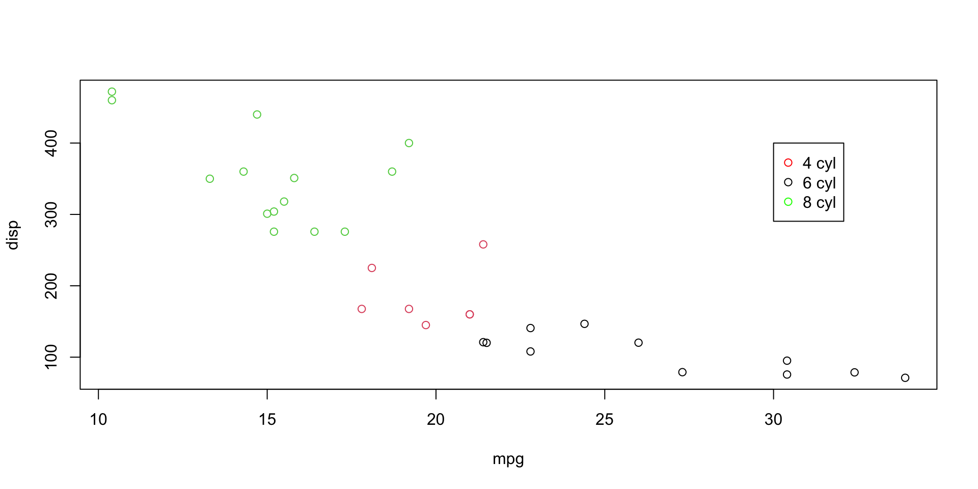
Create a legend that labels points by the number of cylinders cyl. Use red, black, and green for the values or 4, 6, and 8, respectively.
Exercise 1
Exercise 2
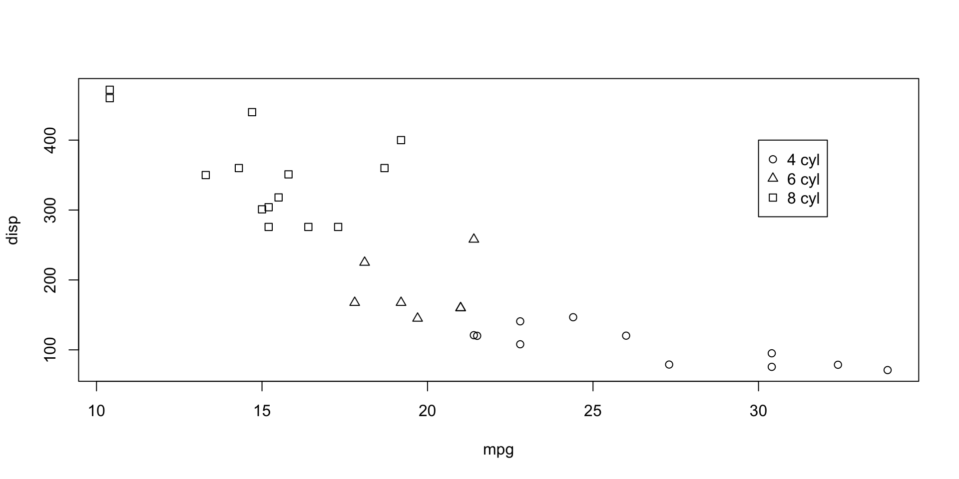
Create a scatterplot for mpg vs. disp. Create a legend that labels points by the number of cylinders cyl. Use circles, triangles, and squares for the values or 4, 6, and 8, respectively.
Exercise 2
par mar
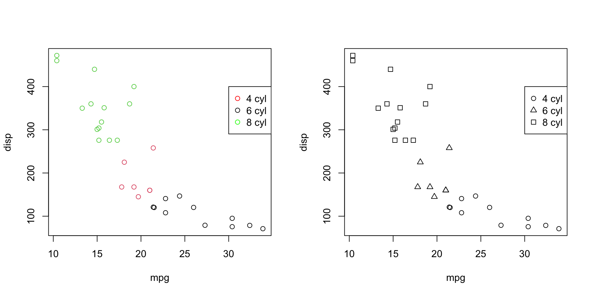
Another helpful graphical parameter setting (recall other on this slide) is
mfrow,mfcolThis expects a vector of the form
c(nr, nc).Subsequent figures will be drawn in an
nr-by-ncarray on the device by columns (mfcol), or rows (mfrow), respectively.
par mar
Saving plots
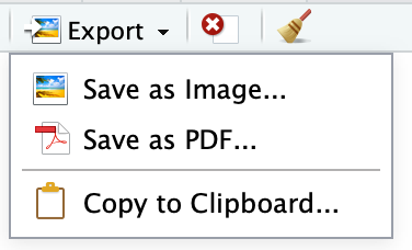
You can save the graph using a variety of methods in R:
- In (base) R: File > Save As
- Using the Export button in RStudio:
Example
Once you’ve completed your plotting with, you can then use one of these file output functions to save the plot to a file depending on the formation you want. Here’s an example using the pdf() function to save a plot to a PDF file:
 button1 and use click and drag on the plotting window.
Comments
Before we make our plot we first open a PDF file using
pdf("boxplot.pdf"), and any subsequent plots will be directed to this PDF file.After completing the plot, we close the PDF device using
dev.off().You can replace
"boxplot.pdf"with the file path and name you want to use; otherwise it will get saved to your working directory.The same approach applies to other file formats; you can use
png(),jpeg(),svg(), ortiff()instead ofpdf()to save plots in those formats.